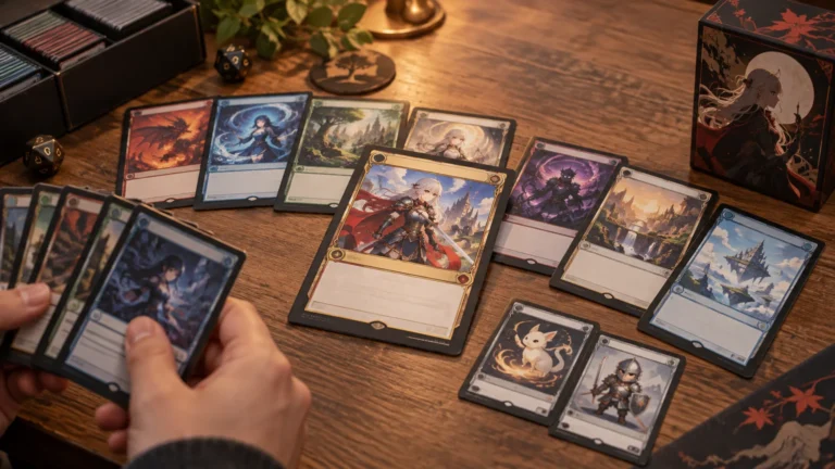
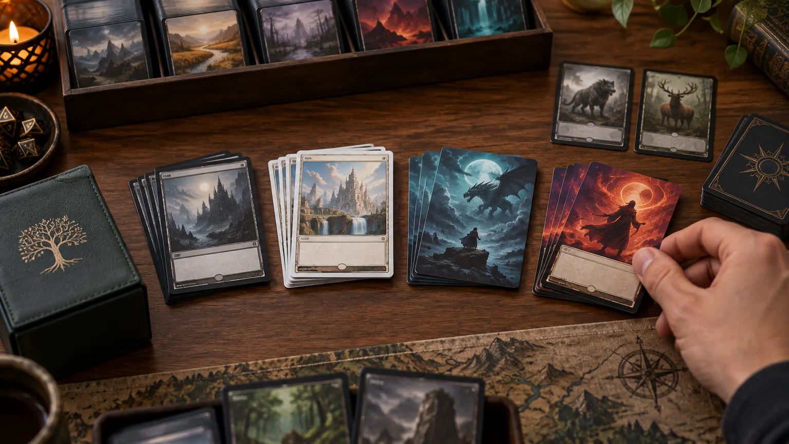
Border Treatments for Proxy Decks: Black, White, Borderless, and Extended Art
TLDR
For most Commander decks, choose one familiar primary frame—standard black border, extended art, or a clearly structured borderless layout—and use it across most of the deck. Add one supporting treatment for the commander, basic lands, or tokens. White borders, retro frames, showcase designs, and full-art layouts work best when they serve a deliberate theme rather than appearing randomly. Whatever you choose, players should be able to find the card name, mana cost, type line, rules text, and power or loyalty almost immediately.
The best MTG proxy border styles do two jobs at once: they make the deck feel intentional, and they let everyone understand the battlefield without repeatedly picking up cards. That usually means resisting the temptation to choose the most dramatic version of every individual card.
My default for a whole Commander deck would be a standard black border or restrained extended-art treatment. Borderless is a strong alternative when its text box remains familiar. I would reserve full-art, minimalist, or highly customized frames for the commander and a controlled set of visually simple cards.
Border, frame, and art treatment are related but different
Players often use “border style” to describe the entire card face, but it helps to separate three choices. The border is the outer edge, such as black or white. The frame organizes the name, cost, type line, text, and combat statistics. The art treatment controls how far the illustration extends behind or around that structure.
Wizards itself uses several distinct labels, including borderless, borderless profile, borderless frame break, retro frame, full art, and extended art. Its Modern Horizons 3 treatment overview shows how many different visual systems can exist within one release. Proxy makers and players do not always use those terms consistently, so inspect the complete card face rather than relying on a version name.
- Standard or modern frame: A familiar card structure with clearly separated information zones and an outer border.
- Extended art: Artwork reaches farther to the sides while the card retains a recognizable information layout. Wizards describes this as art extending horizontally beyond traditional frame limits.
- Borderless: Art reaches or approaches the card edge, although the name, rules text, and other elements may still sit in conventional positions.
- Full art: In this guide, an art-forward treatment in which the illustration dominates most of the face. It is a useful design category, not a single universal template.
- Retro or old border: A treatment inspired by earlier Magic frames, usually chosen for nostalgia or a period-specific identity.
- Showcase or special frame: A stylized frame tied to a particular visual grammar, setting, or theme.
- Custom or minimalist frame: A creator-defined layout that may move, simplify, or remove familiar structural elements. This offers the most freedom and requires the most careful testing.
How the main MTG proxy border styles compare
| Treatment | Recognition | Text capacity | Cohesion potential | Best use | Main caution |
|---|---|---|---|---|---|
| Standard black border | Very high | High | High | Whole decks and complex cards | Can feel visually conservative |
| White border | High when the inner frame is familiar | High | High with deliberate use | Retro themes, reprint-inspired decks, or role coding | Shows edge contrast strongly and can look accidental if only a few cards use it |
| Extended art | High | High to medium | Very high | Art-forward Commander decks | Busy artwork can compete with the text box |
| Borderless | High to medium | Medium | Very high | Commanders, signature spells, or a complete coordinated deck | Card edges can blend into dark sleeves or neighboring permanents |
| Retro frame | High for familiar players | Medium | High | Old-school Cubes, artifacts, and nostalgic themes | Modern, text-heavy cards may feel cramped |
| Showcase frame | Medium | Medium | High within one visual family | Plane-themed or faction-themed projects | Mixing unrelated showcase families creates visual noise |
| Full-art or custom | Variable | Low to medium | Very high when designed as a system | Basics, tokens, commanders, and simple effects | Moved or low-contrast information slows recognition |
Choose with four filters, not one
1. Recognition
Recognition starts with predictable placement. A player should not have to search the illustration for a floating card name or wonder whether a small decorative line is the type line. Familiar structure matters most on cards that stay in play, accumulate counters, grant abilities, or create replacement effects.
Distinct artwork also matters. A community discussion about full-art proxy decks highlighted stable name and text placement, contrast, distinctive images, and avoiding many similar-looking permanents as practical readability factors. That is anecdotal table experience rather than controlled usability research, but it points toward a useful design test: cards must remain distinguishable after they leave your hand and join a crowded board.
2. Readability
More art does not automatically mean less readable. The real issue is whether the design preserves contrast, space, and hierarchy. A borderless card with a solid text box may be easier to read than a standard-frame card printed with tiny text over a detailed background.
Keep complicated cards in conventional layouts with generous text areas. Retro styling deserves particular care because adapting modern cards to older frame constraints can be difficult, especially when the rules text is long. If fitting the card requires shrinking the text aggressively or tightening every margin, use a roomier treatment.
3. Cohesion
Cohesion does not require every card to be identical. It requires repeatable rules. A deck can use one frame for spells, another for basic lands, and a third for tokens while still looking unified. Shared typography, text-box opacity, icon placement, and color treatment often create more cohesion than forcing every illustration into the same border.
The danger is collecting favorite versions one card at a time. Five unrelated showcase frames may each look excellent in isolation, yet together they make the deck resemble a sampler binder. Pick a visual language first, then choose versions that belong to it.
4. Card role
Not every card carries the same information burden. A basic land can support a dramatic full-art treatment because players rarely need to inspect its text. A commander can also be visually loud because it begins in a known zone and acts as the deck's centerpiece. A complicated permanent that changes combat math should prioritize fast reading instead.
- Good candidates for bold treatments: basic lands, straightforward tokens, emblems, the commander, simple mana rocks, and visually distinct signature spells.
- Safer candidates for familiar frames: text-heavy engines, double-faced cards, planeswalkers, modal spells, unusual lands, and permanents opponents will need to reread.
- Treat with extra care: cards that create multiple continuous effects, copy other objects, modify characteristics, or rely on small reminder text.
A practical one-plus-one system
A reliable way to style a 100-card deck is the one-plus-one system: one primary treatment for ordinary cards and one supporting treatment for a clearly defined category. That gives the deck personality without turning every draw into a new interface.
For example, use extended-art frames for the main deck, full-art treatments for basic lands, and a distinctive borderless commander that still shares the deck's typography. Tokens can use their own frame because they form a separate game component, but they should remain easy to match to the effects that create them. A dedicated token package for the deck is more useful than a pile of beautiful tokens nobody can identify quickly.
White borders can work as the supporting treatment too. They are especially effective when used for one functional group, such as basics or a graveyard package. The contrast makes that category easy to spot. Using three random white-bordered cards in an otherwise black-bordered deck, however, tends to look like an ordering mistake rather than a design decision.
What a coherent Commander deck looks like
Imagine an enchantment Commander deck. The noisy version gives the commander a painterly full-art frame, uses three unrelated showcase families for enchantments, puts retro frames on the mana rocks, and mixes black- and white-bordered lands. Every card may be attractive, but the battlefield has no visual hierarchy.
The cleaner version uses borderless frames with opaque rules boxes for spells. Full-art basics share one color treatment. The commander gets a more decorative version, while complex engines retain conventional text placement. Tokens use a high-contrast template with large names. The result still feels custom, but each visual change communicates a role.
That same discipline helps with strongly themed art. If the deck uses one illustration style across many cards, vary composition, dominant colors, and silhouettes enough to distinguish adjacent permanents. The principles in this guide to themed proxy recognition apply well beyond anime-style decks.
Cube needs consistency without sameness
A Cube can support a stronger global identity than a Commander deck because the entire environment is curated as one object. The catch is that drafters may be seeing many cards for the first time. The frame system needs to teach the environment rather than assume everyone already knows it.
Use treatments as stable signals. You might assign one frame family to monocolored cards, a restrained special frame to multicolored cards, and a clearly distinct treatment to lands. Do not let rarity, archetype, or card type drift between several visual systems unless that coding is deliberate and explained.
Before committing hundreds of cards, print a small test pack containing a creature, instant, planeswalker, multicolored card, artifact, and nonbasic land. Sleeve them, spread them across a table, and hand them to someone who did not build the Cube. For a fuller workflow, see the guide to Cube proxy consistency and draft readability.
Run the three-second table test before printing
Export a representative sample rather than judging only enlarged files on a monitor. If you are preparing a complete deck through an MTG proxy printing service, include your busiest cards, darkest art, longest text boxes, and each planned frame family in the first visual review.
- Can you find the name, mana cost, type line, rules text, and power, toughness, or loyalty immediately?
- Can you distinguish each permanent from the two cards beside it?
- Does important text remain clear at physical card size rather than only when zoomed in?
- Does the text remain readable through the intended sleeve under ordinary room lighting?
- Do dark borderless edges disappear into the sleeve or playmat?
- Are similar illustrations likely to be confused across a crowded battlefield?
- When ten cards are spread out, does the deck still look like one designed object?
- Can another player identify which cards are tokens, commanders, lands, and ordinary permanents?
If a card fails, simplify the background behind the text, increase contrast, restore familiar element placement, or move it into the primary frame. Changing one troublesome card is better than defending a design choice through every game.
Border treatment does not decide event acceptance
A black, white, borderless, or retro treatment does not by itself determine whether a card can be used at a sanctioned event. Event requirements involve more than visual style, and casual playgroup acceptance is not the same as tournament acceptance. Consult the current Magic Tournament Rules and ask the organizer before bringing proxies or other substitute cards to an event. Wizards maintains current rules documents on its WPN Rules and Documentation page.
The best default for each kind of deck
Choose a standard black border when maximum familiarity and text capacity matter. Choose extended art when you want more illustration without abandoning a recognizable information structure. Choose borderless when you want a polished, art-forward deck and can preserve strong text boxes. Choose white borders when their contrast supports a retro theme or clearly defined card role.
Use retro frames for a deliberate nostalgic project, artifact-heavy theme, or old-school Cube—not merely because a few individual cards look charming. Use showcase frames when one world or visual grammar ties them together. Keep full-art and heavily custom treatments in controlled roles unless the layout has exceptionally clear hierarchy.
The next step is simple: select six representative cards, apply your proposed system, print them at actual size, sleeve them, and place them on a busy table. If another player can identify and read them without coaching, the style is doing its job. If not, keep the art and give the information more structure.