MTG Proxy Art: Choose Alternate Art That Still Reads Across the Table
TLDR
The best MTG proxy art makes a deck feel personal without turning every game into a recognition test. Give the boldest treatment to your commander, tokens, basic lands, and a small package of signature spells. Keep card names, mana costs, type lines, rules text, and combat-relevant statistics conventional and readable on the permanents opponents must track. Before printing a complete deck, test a few sample cards at normal table distance and ask whether someone unfamiliar with your theme can identify them quickly.
Alternate art works when it adds identity without hiding information. A gorgeous card that requires three explanations per turn is not finished design; it is homework for the rest of the pod. My default plan is one centerpiece commander, 10 to 15 visually ambitious spotlight cards, coordinated lands and tokens, and a restrained standard layout for everything else.
What good MTG proxy art needs to accomplish
I judge MTG proxy art by four things: recognition, readability, cohesion, and table fit. Recognition tells players what the card is. Readability lets them verify what it does. Cohesion makes the deck look intentional. Table fit accounts for where and how the deck will be played.
Recognition is more than remembering a picture. The real card name should be prominent and located where players expect to find it. Familiar frame structure, recognizable mana symbols, and consistent information placement help opponents scan the battlefield without reading every card from scratch. In community discussions about alternate-art decks, players repeatedly identify preserved names, conventional layouts, and legible text as useful; heavily reskinned or text-light cards are more often described as slowing board-state scanning. Those are practical observations rather than universal preferences, but they point toward a sensible design baseline.
Readability means the important information survives outside a full-size design preview. Thin decorative fonts, low-contrast text boxes, and elaborate art crossing the name or rules area can all look impressive on a monitor and fail inside a sleeve. Shrink the design to actual card size. Then put it on a table, stand or sit at the usual playing distance, and see what remains obvious.
Cohesion does not mean making 100 cards nearly identical. It means repeating a controlled visual language: perhaps one border style, a limited color palette, consistent typography, and matching treatment for cards with related jobs. A deck can contain several kinds of art while still looking unified.
Table fit is the final filter. A private pod familiar with every card may enjoy aggressive reskins. A store game with new opponents benefits from conventional names and layouts. Webcam play needs stronger contrast and larger visual landmarks; the practical requirements are covered in more detail in the guide to readable proxies on SpellTable.
Choose the art treatment by the card’s job
Not every game piece carries the same information load. A basic land usually asks less of the table than a planeswalker with several abilities. Match the visual ambition to how often opponents need to identify, read, target, or count the card.
| Art treatment | Best uses | Main advantage | Main risk |
|---|---|---|---|
| Standard layout with alternate art | Most creatures, artifacts, enchantments, and interaction | Personal style with familiar information placement | Busy art can still reduce text contrast |
| Full-art layout with readable text | Commander, signature spells, simple permanents | Strong visual impact without abandoning rules information | Decorative elements can crowd the name, cost, or text |
| Heavily reskinned treatment | A small spotlight package in a familiar pod | Creates a distinctive theme | New names or unfamiliar symbols slow recognition |
| Textless or image-first treatment | Basic lands, simple tokens, dividers, display pieces | Maximum room for art | Poor fit for cards whose rules or identity must be checked |
| Coordinated land and token package | Basics, recurring tokens, emblems, counters | Makes the deck feel complete without reskinning every spell | Similar tokens may become hard to distinguish |
Where bold art usually works best
The commander is the natural centerpiece. It starts in a known zone, appears repeatedly, and anchors the deck’s theme. Keep its real name, cost, type line, rules text, and power and toughness easy to find, but let the illustration and frame carry more personality than the rest of the deck.
Tokens are another good canvas because you control their visual vocabulary. Make each recurring token category distinct at a glance. A 1/1 Soldier, a 2/2 Zombie, and a Treasure should not share nearly identical compositions or color palettes. If the deck creates copies, counters, emblems, or unusual predefined tokens, build the entire package together rather than adding mismatched pieces later. The complete MTG token proxy checklist can help identify what the deck actually produces.
Basic lands tolerate expressive art because their battlefield role is simple, especially when the card still displays a clear land type or mana symbol. Dividers and deck-box inserts are even safer places for textless illustration. Signature spells can also receive a dramatic treatment, but choose cards the deck treats as events rather than routine infrastructure.
Where restraint improves the game
Be conservative with cards that build dense battlefield states. Value engines, lords, equipment, auras, planeswalkers, sagas, modal cards, and permanents with activated abilities all invite repeated inspection. Combo pieces and frequently referenced interaction should also remain easy to identify. Opponents need to know what can happen before they commit to an attack or spell.
Avoid changing the card name simply to complete a fictional reskin. A subtitle can carry the theme while the real name remains dominant. If you replace both the recognizable art and the recognizable name, other players lose the two fastest ways to identify the object. That may be manageable for one commander; across an entire deck, it becomes friction.
The same principle matters even more in Cube. Drafters must evaluate unfamiliar cards quickly, remember what they passed, and read decks assembled from a shared pool. Consistent information placement is therefore part of the play experience, not just a graphic preference. For a larger draft project, use the workflow in the themed proxy Cube guide.
A practical visual plan for a Commander deck
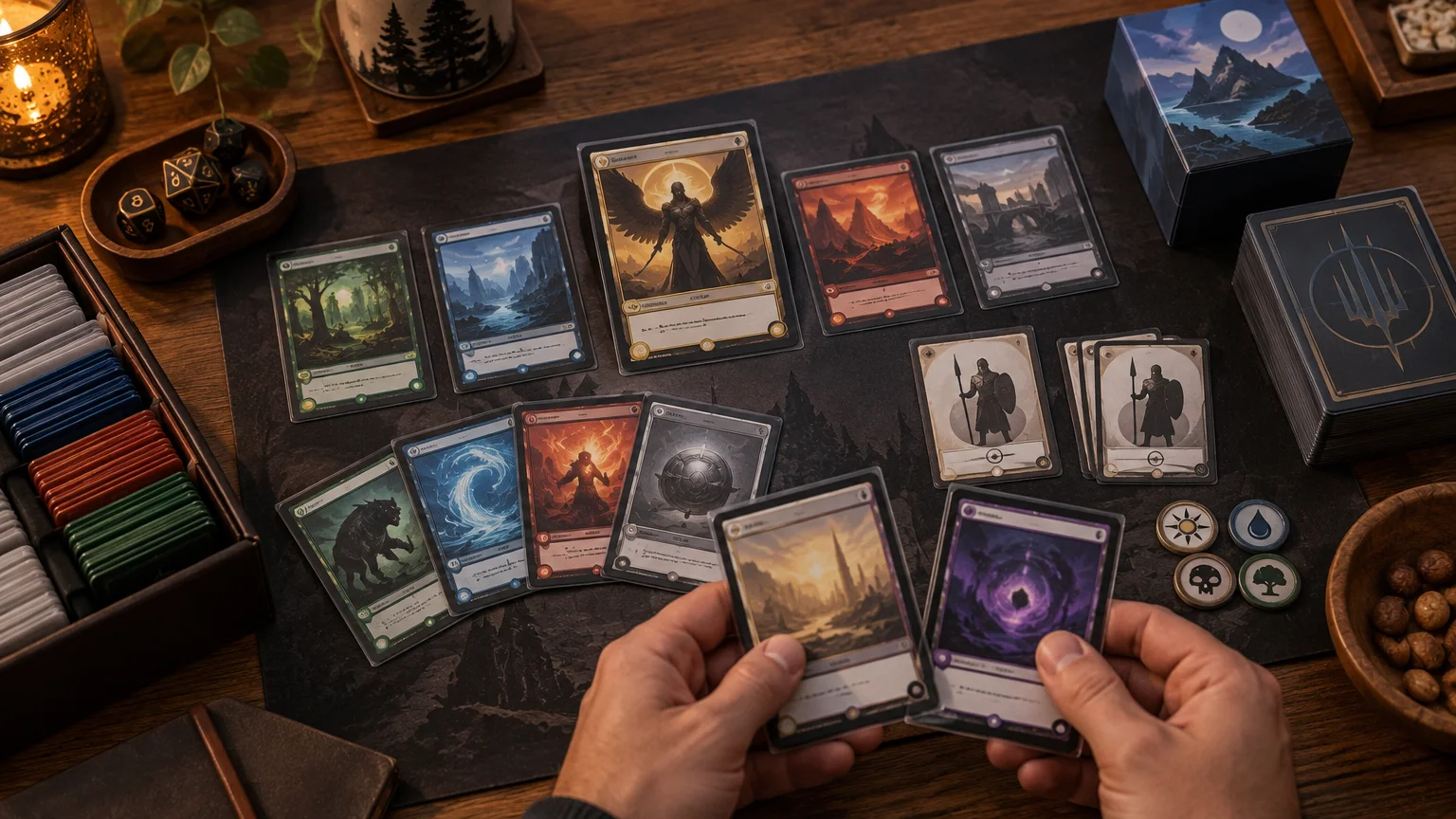
Commander uses a 100-card deck consisting of a commander and 99 other cards, so an all-custom treatment creates many opportunities for inconsistency. Wizards’ Commander format overview provides the current basic format structure. Instead of designing every slot at maximum intensity, divide the project into visual tiers.
- Choose one centerpiece treatment for the commander. Use the strongest illustration and decorative framing here, while retaining complete gameplay information.
- Select 10 to 15 spotlight cards. These might include a favorite finisher, a signature engine, two or three flavorful creatures, and a few spells central to the deck’s story.
- Create a coordinated basic-land package. Repeat a palette or setting, but keep different land types distinguishable by color, symbol, or composition.
- Build matching tokens and markers. Prioritize functional differences before aesthetic consistency.
- Give the remaining cards a readable standard layout. Repeat typography, borders, and restrained accents so they still belong to the same deck.
Consider a sea-monster deck as an example. The commander might receive borderless storm art and a frame resembling dark water. Twelve major creatures could use related ocean scenes, while the Islands share a calmer version of the palette. Kraken, Tentacle, Treasure, and copy tokens would each receive distinct silhouettes. Ramp, removal, protective spells, and complicated utility permanents would keep a conventional frame. The result feels themed immediately, but an opponent can still parse the machinery of the deck.
This tiered approach also makes revision easier. Print a small sample, test it, and correct weak contrast or confusing layouts before committing to the whole list. Once the files are settled, players who want a complete physical stack can consider printing a complete proxy deck rather than mixing several visibly different production batches.
The pre-print readability check
A design is not ready merely because the source file looks clean at 200 percent zoom. Review every card at final size and then test the most ambitious examples under ordinary playing conditions.
- Card name: Is the real card name visible, prominent, and separated from the illustration?
- Mana cost: Can players find and distinguish every symbol quickly?
- Type line: Are supertypes, card types, and subtypes readable?
- Rules text: Is the font large enough, with adequate contrast and line spacing?
- Combat information: Are power and toughness, loyalty, defense, or other relevant values obvious?
- Layout consistency: Does information appear in roughly the same place throughout the deck?
- Art distinction: Can similar tokens, lands, and related permanents be told apart?
- Card-size preview: Does the design still work when displayed or printed at actual size?
- Table-distance test: Can another player identify the card without picking it up?
- Sleeve test: Do glare, dark sleeves, or a tinted sleeve front reduce contrast?
- Pod or store check: Are the people and venue involved comfortable with the proposed proxies?
For a useful test, show a sample card to someone who knows Magic but has not followed the design process. Ask for the card name, mana value, card type, and a short account of what it does. If the answer depends on your explanation, revise the layout rather than assuming everyone will learn it during play.
Casual proxies, sanctioned play, and art rights
Player-made proxies intended for casual games should not be presented as legal cards for sanctioned tournament play. The February 27, 2026 Magic Tournament Rules require genuine, publicly released Magic cards in sanctioned events, apart from limited circumstances in which tournament officials may authorize substitutes. The same document distinguishes those judge-issued tournament proxies from ordinary player-created cards. Check the current version of the Magic Tournament Rules before attending an event because tournament policy can change.
The tournament rules also place limits on artistic modifications to genuine cards: among other restrictions, an alteration cannot make the art unrecognizable or obscure the card name or mana cost. That rule is not a general design license for player-made cards, but it reinforces how important visible identity and cost are in organized play.
Use artwork you created or have permission to use, and confirm the terms attached to commissioned, licensed, or generated images. Wizards’ Fan Content Policy says its fan-content permission does not include creating counterfeit or proxy Magic cards, warns against using third-party intellectual property without the necessary rights, and does not provide individualized legal advice for a custom-art project. Treat it as one policy document, not a complete answer about copyright, contracts, service terms, or local law.
Make the deck memorable, not mysterious
Strong MTG proxy art gives a deck a point of view. It can make the commander feel legendary, connect the lands to the setting, and turn the token package into part of the deck rather than an afterthought. It does not need to disguise every familiar game piece to achieve that effect.
Start with the commander, three representative spotlight cards, one basic land, and the two tokens you create most often. Print those samples at card size, sleeve them, and play a couple of games. If opponents can identify them without repeated explanations, expand the treatment. If the table slows down, preserve the art and simplify the typography or frame. A deck that looks good and plays cleanly will be enjoyed far more often than one that only works in a design preview.
References
- Thoughts on a proxy deck with alternate art and card names, but the same mechanics as real cards?
- Does an all full-art deck reduce readability?
- What reactions do you get to "Alt Art" proxies when you use them IRL/with strangers?
- MTG Commander Format | Magic: The Gathering
- MAGIC: THE GATHERING® TOURNAMENT RULES
- Fan Content Policy | Wizards of the Coast